IDEAS: Customer Segmentation Retetion/Churn Value of your customer database Projection Customer, loyality, retention and value Movements Segments Dynamics PAST- Retention, Churn PRESENT- Segments, Value FUTURE -Projection of segmetns and value WHY IS THIS IMPORTANT? Because it would help you unlock the direction of your customer database and improve your retention strategy. Replicabel with your transactional dataset

Understanding our Customer Database is essential to understand our business. Not only which are the loyal clients, the new ones, the ones that are more likely to churn or the high value ones, but also understanding the dynamics between this groups and what is the trend moving forward.

We can learn about what makes a customer stay or leave and define out strategy by simply analyzing historical transactional data.

For this example I will use a dataset provide by the UCI, which contains all the transactions occurring between 01/12/2010 and 09/12/2011 for a UK-based and registered non-store online retail.
Continue reading

Do you love Alteryx but have already complex SQL queries that you would like to use as your input data? Alteryx is great and it is usually my go to point when I need to manipulate data. However, in the team we also use SQL quite often, for instance, there are some pre-defined queries that make it easier for us to get the output we want. In some cases, I want to develop further manipulation or analysis on those tables connecting them directly to Alteryx.
Continue reading

R & Git

I have being using R since I was at uni and I did recently discovered how to sync it with Github for version control of projects which is making my life much easier. I love being to have a version control of my project. Moreover, I can use any computer to work on my app which is giving me a lot of flexibility. There are obviuosly other tool as Google Drive, One Drive…that you can use to save your work through laptops but I just find the integration of R with Github very handy.
Continue reading

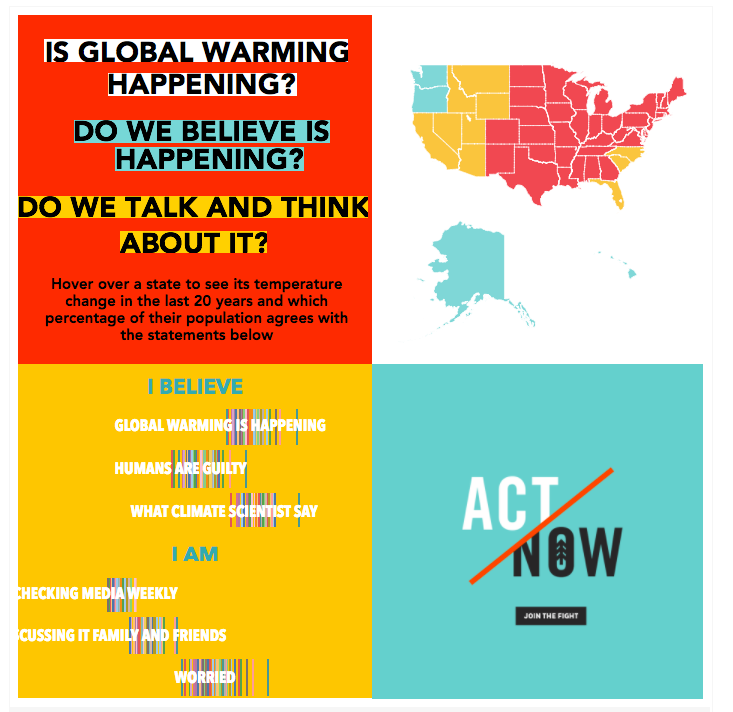
Following from the previous post on “Tableau filters - Part I”, let’s get down to the nitty gritty how tos! We start with a graph and a filter, simple. The following graph shows the percentage of people per state that agree with each of the statements. Each state is a bar, the more on the right the bar is the bigger percentage of the population in that specific state agrees with that sentence.
Continue reading

When it comes to Tableau Dashboards, I am known as a filter-hater within my team. I find them ugly and not very user friendly. That’s why I always try to find new ways to make filters more user-friendly. It usually helps me going through the following process: Built a Dashboard that is able to show the needed level of detail (use all the filters you need) See if some coloring/shaping can help If filtering is needed, can you incorporate it nicely in the view?
Continue reading

Author's picture

Analytics and Inspirational Ideas

Data Visualization, Analytics and Science

Bilbao-London