Tableau filters - Part II
Following from the previous post on “Tableau filters - Part I”, let’s get down to the nitty gritty how tos!
We start with a graph and a filter, simple.
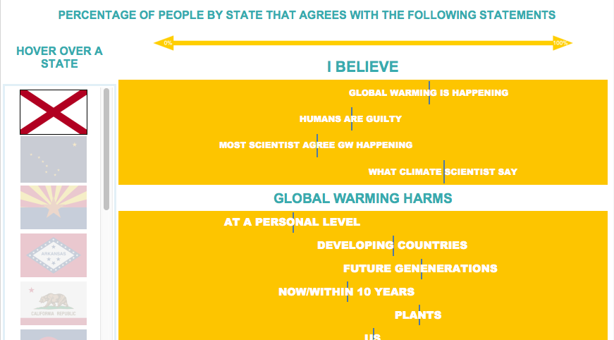
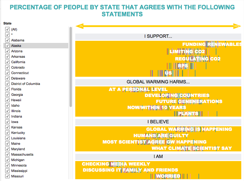
The following graph shows the percentage of people per state that agree with each of the statements. Each state is a bar, the more on the right the bar is the bigger percentage of the population in that specific state agrees with that sentence.
First, we will create a new sheet listing of the options in the filter, step by step.
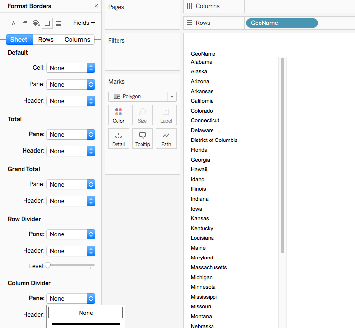
Bring the Dimension you want to show to rows.
On the Marks box choose the Polygon option.
Format the sheets setting the borders to None.
Format the Text as you wish. I like centering and making it grey and bold but that is a personal preference.
Add it to the Dashboard and click on the top right of the sheet, where you can see a filter icon.
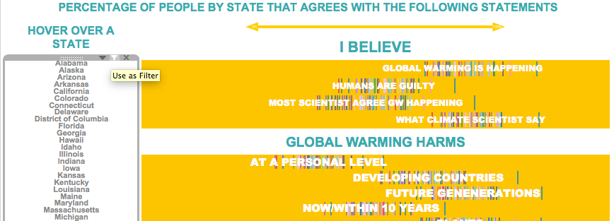
So far you will be able to use the sheet as a filter for your other graph by clicking any of the names.
Do you want to still make it a bit nicer and use icons instead or words?
Let’s see how we can do that.
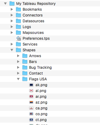
- Find the icons you want to use and save then on My Tableau Repository/Shapes.(In this case I googled USA states flag icons and download them.)
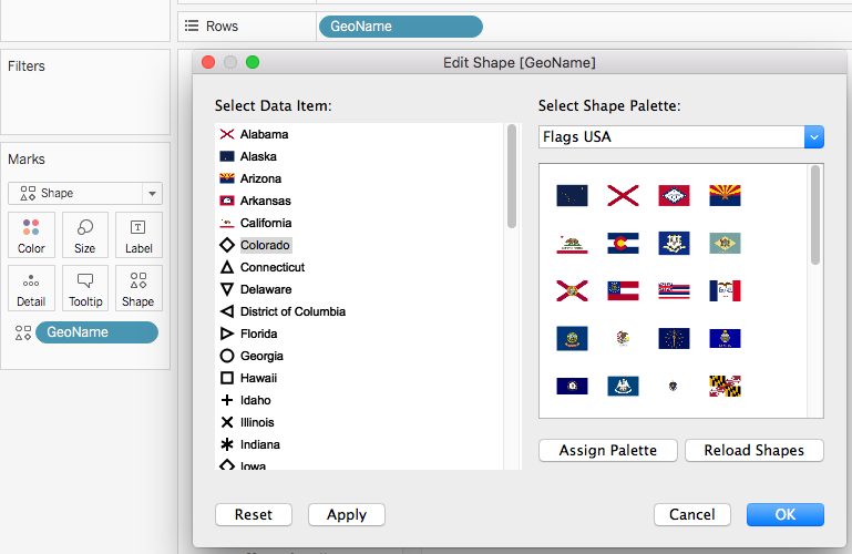
Open the sheet again and change the Marks type to Shape.
Drag the Dimension into the Shape box.
Click on the Shape box and assign a shape to each name. (Note: If you can not see the shapes you have just added try clicking on Reload Shapes.)
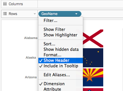
- Dis-select “Show Header” from the dimension on rows.
We are all done, you can now click on the icon in order to filter your view!