Tableau filters - Part I
When it comes to Tableau Dashboards, I am known as a filter-hater within my team. I find them ugly and not very user friendly. That’s why I always try to find new ways to make filters more user-friendly.
It usually helps me going through the following process:
- Built a Dashboard that is able to show the needed level of detail (use all the filters you need)
- See if some coloring/shaping can help
- If filtering is needed, can you incorporate it nicely in the view?
- Do not be afraid of using more than one view. If more detail is needed you can cover it on a more specific view.
Here are some of the options I have used so far to make my views less full of filters and more user-friendly:
- Consider Highlighting. Sometimes Highlighting is enough and there is no real need for filters
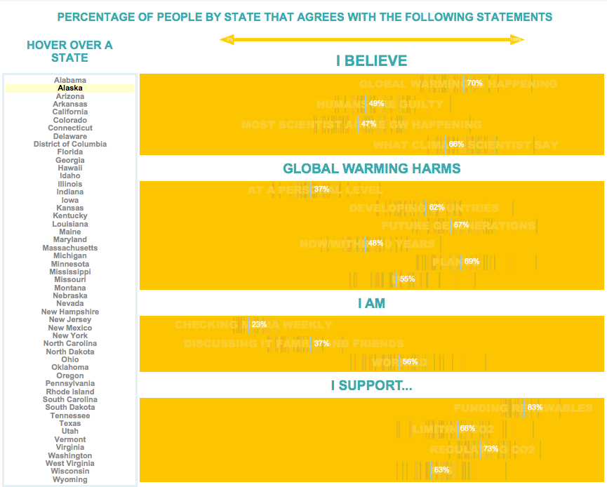
- Create a sheet listing the options. You can create a sheet that serves as a filter/highlighter on a Dashboard. It feels more userfriendly to see all the posible options.
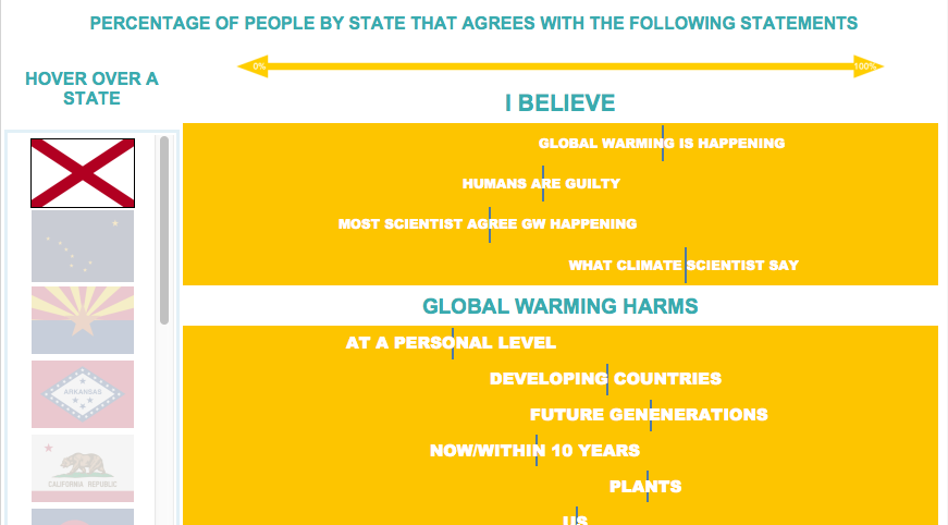
- Use icons. Similar to the previous option but more user friendly, you can show icons to click on as filters.
Use another graph as a filer. You can use a graph that is already in the view to serve as a filter for the rest.
Hover to filter. As an addition to the above, you can make the user hover over to filter, this can be useful when the data set is not too big and so the filter is quick. When it needs some seconds to update I would suggest using the click option
I will cover some of these in my next posts!
To be continued…
